On the evening of December 24th, somewhere high above the clouds, Santa Claus was not in a good mood.
The sleigh was polished. The reindeer were ready. The elves had done their usual magic.
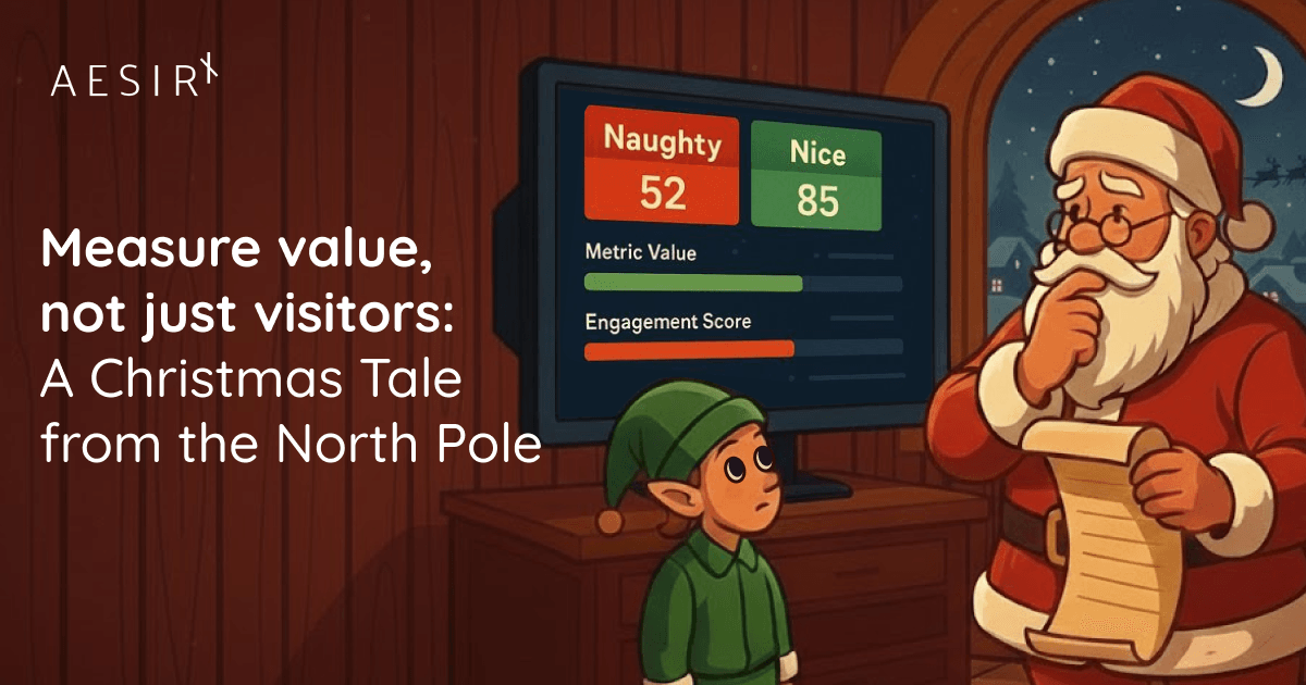
But in the workshop, a giant crystal dashboard floated in the air, glowing with numbers… and Santa was squinting at it, unimpressed.
“Look at this, Data Elf,” he grumbled. “Visitors to the Nice List are up 37%. Cookie clicks per chimney are up 12%. Reindeer impressions are at an all-time high. And yet—”
He tapped the glass, and the numbers wobbled.
“—I still don’t know if I’m actually making kids happier this year than last year. This thing just tells me everything is busy.”
The Chief Data Elf (head of North Pole Analytics, naturally) sighed.
“Sir, with respect,” she said, “that’s because you’re still measuring traffic, not value.”
Santa’s old dashboard problem
For centuries, the North Pole had been proudly data-driven.
Santa’s original analytics were simple:
How many letters received.
How many chimneys visited.
How many presents delivered.
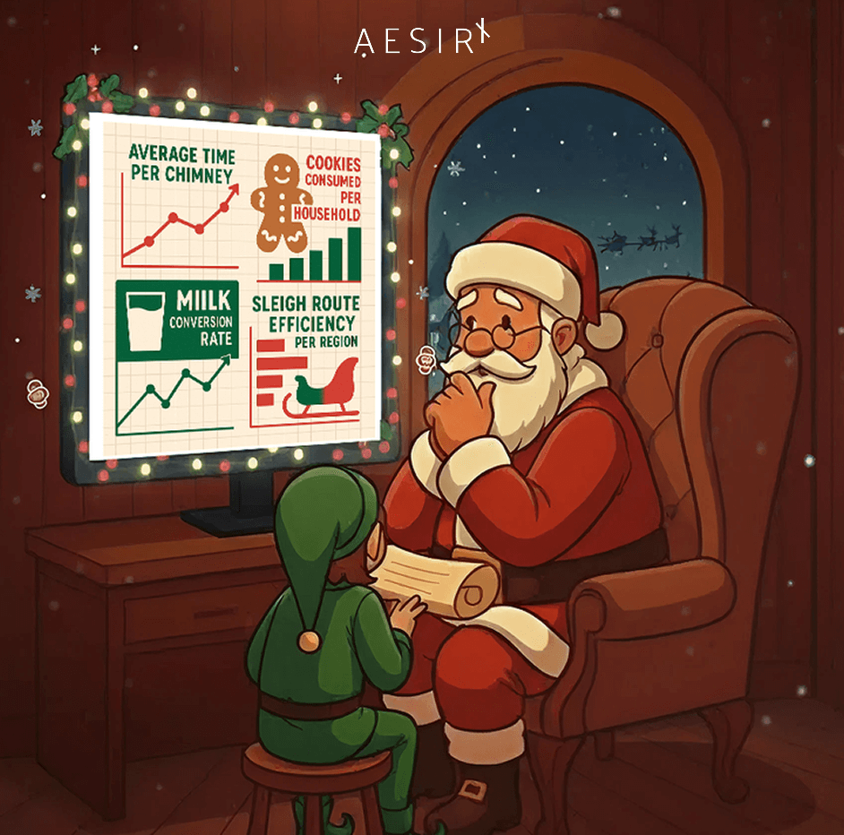
Over time, the elves added more metrics:
- Average time per chimney
- Cookies consumed per household
- Milk conversion rate
- Sleigh route efficiency per region
The dashboard looked fantastic. Lines went up and to the right. Charts pulsed with activity.
And yet, when Mrs. Claus asked the only question that mattered—
“Did we actually make more children genuinely happy this year?”
—Santa could only shrug.
“We sent more gifts,” he’d say. “We had more visits. The charts are very green.”
“But were they the right gifts?” she would ask. “For the right children? At the right time? In the right homes?”
He didn’t know. The system counted movement. It didn’t really understand meaning.
Naughty, nice… and everything in between
The Naughty/Nice List had always been binary.
You were either on the Nice side (green), or the Naughty side (red). One bit of data. One decision.
It was simple… and completely insufficient.
What about the kid who had a rough year, misbehaved sometimes, but spent hours helping a younger sibling?
What about the child who was perfectly polite but utterly indifferent to their gifts?
What about the teenager who wrote a heartfelt letter in November, then ghosted Santa for the rest of the season?
From Santa’s perspective, the old system looked like this:
- He knew how many children he visited.
- He knew how many presents he dropped down chimneys.
- He knew how many cookies he ate (unfortunately).
But he didn’t really know:
- Which visits created the most joy.
- Which gifts were quietly regifted, ignored, or traded away.
- Which children felt truly seen and understood.
He could feel the gap, but the dashboard couldn’t show it.
Enter metric value and engagement score
So one chilly morning in December, Data Elf called a workshop.
“We need to stop thinking in Naughty vs Nice,” she said, “and start thinking in value.”
Santa raised an eyebrow. “Value? You mean money?”
“Not exactly,” she said. “I mean two kinds of value:
- Metric value - how much a visit or gift is worth in terms of real impact: joy, usefulness, long-term memory.
- Engagement value - how deeply the child is actually interacting with the North Pole: letters, drawings, traditions, excitement, family rituals.”
She spread out a magical scroll.
“Right now, we count visits and gifts. But we don’t distinguish between:
- A plastic trinket that breaks by January 2nd
- A book a child reads ten times and keeps for years
- A shared board game that creates three hours of family happiness on Christmas Eve”
Santa’s eyes softened. He knew exactly which kind of gift he preferred to give.
“From this year,” the Data Elf said, “every gift and every interaction gets two scores:
- A metric value score, to measure how meaningful the gift is likely to be.
- An engagement score, to measure how strongly the child is leaning into the whole Santa experience.”

Designing Santa’s new scoring model
Together with the Toy Strategy Department, they defined a simple model.
Metric value examples:
- Small, generic toy → metric value: 10
- Personally requested gift (from a letter) → metric value: 40
- Gift that supports a real interest (music, drawing, science) → metric value: 60
- Gift that brings the family together (board game, shared experience) → metric value: 80-100
Engagement value examples:
- No letter, no message → engagement: 0-5
- One quick list of wishes → engagement: 10-20
- Hand-written letter with drawings and questions → engagement: 40-60
- Ongoing tradition: cookies prepared, stocking hung, family reading Santa stories together → engagement: 70-100
Now, a visit wasn’t just:
“Child #4021 in Denmark. Nice List. Delivered present.”
It became something like:
“Child #4021 - high engagement (77), high metric value (85).
Long letter, family board game, lots of excitement. Very strong outcome.”
Or, in other cases:
“Child #9812 - low engagement (10), low metric value (15).
Generic toy, barely any signal. We showed up… but didn’t really land.”
The Naughty/Nice List was still there (Santa did have standards), but it was no longer the whole story.
Now, each child was a little journey of value and engagement.

The next thing the elves did was overhaul Santa’s main dashboard.
Instead of just showing:
- “Total children visited: 1,312,453”
- “Average cookies consumed: 3.2 per home”
the new UX Flow (User eXperience Flow, as the elves called it) showed:
- Top journeys by total metric value - the routes where Santa created the most joy.
- Top journeys by average engagement - the homes where the Santa experience really came alive.
- Quiet but powerful paths - low volume, very high value.
For example:
- Flow A: “Santa story → letter written → stocking hung → Santa visit → family game night”
- Medium number of children.
- Very high metric value.
- Very high engagement.
- Flow B: “Last-minute wishlist → rushed visit → random toy → child shrugs”
- High volume.
- Low metric value.
- Low engagement.
For centuries, Flow B looked like a success: lots of visits, lots of gifts, lots of cookies.
Now, on the UX Flow board, it looked exactly like what it was:
busy but shallow.
Flow A, on the other hand, used to be almost invisible. It didn’t generate more “traffic”, but it created the kind of Christmas Santa actually wanted to give: deep, shared, lasting.
That’s where he told the elves:
“These are the journeys we should design for.
These are the homes we should learn from.
These are the moments we want more of.”
Real-time: watching Christmas magic in motion
On Christmas Eve, when the sleigh finally took off, Santa got his favourite gift: a brand new real-time dashboard.
Gone was the lonely number: “Active chimneys: 4,872”.
Instead, he saw a living map of the world with little glowing dots, each representing a home:
- Some dots glowed faintly - low engagement, low metric value expected.
- Some flickered, uncertain - mid-level engagement, generic presents.
- Some shone like stars - high engagement homes where Santa knew his visit would land like a small miracle.
As the sleigh soared from house to house, Santa could see the scores updating:
- A child who had written a letter weeks ago recognised the exact gift they’d wished for: metric value up.
- A family gathered around the fireplace to open a board game together: engagement up.
- A teenager found a book that made them feel understood: both scores rose quietly but meaningfully.
This time, Santa wasn’t just watching “deliveries completed” or “chimneys cleared”. He was watching value being created in real time.
And when the night was over, and he was back by the fire with Mrs. Claus, he could answer her question without hesitation.
“Yes,” he said. “This year, we made more real happiness. Not just more trips.”
What this has to do with you (and your analytics)
If you swap out Santa for your agency, the story probably feels familiar.
- The Naughty/Nice List is your old “conversions vs non-conversions” view.
- Chimney visits are your sessions and pageviews.
- Cookies consumed are your clicks and impressions.
They all tell you that something happened.
They don’t really tell you whether it mattered.
A value-based model - with metric value and engagement score for the journeys that count - lets you read your visitors more like Santa now reads his Christmas Eve routes:
- Quiet flows that lead to deep outcomes become visible.
- Noisy flows that consume budget but create almost no joy stand out as waste.
- “Real-time” stops being a novelty and becomes a way to see where something meaningful is about to happen.
And AesirX in all of this?
When we build AesirX Analytics, this is the world we have in mind.
A world where:
- Campaigns don’t just bring visitors, they bring value profiles.
- Events aren’t just logs, they’re signals of intent and depth.
- Journeys aren’t lines on a chart, they’re stories of how value and engagement build over time.
- Real-time views don’t show random activity, they show where your equivalent of Christmas magic is happening right now.
Santa has his own first-party data stack (the elves are very strict about privacy).
You should have one too.
If this Christmas you find yourself staring at a dashboard full of busy numbers, maybe it’s time to ask a very Santa-style question:
“Am I measuring visits, or am I measuring value?”
And if you’d like your analytics to feel a bit more like that upgraded North Pole dashboard - where metric value and engagement scores make the story clear - AesirX Analytics is built to do exactly that.
Until then, may your flows be meaningful, your visitors engaged, and your work create the kind of outcomes that would make even Santa nod in approval.
Ronni K. Gothard Christiansen
Technical Privacy Engineer & CEO @ AesirX.io